Next time you take a wrong turn trying to find an out-of-the-way gallery we hope you don’t run into Harland Miller – you might just miss the opening. “If you were lost and stopped to ask a passer-by for simple directions – you’d be unlucky if that passer-by was me,” the artist says, “because I have a way of over-talking things, even getting from A to B.
“This may be a kind of condition, and I think my ‘Letter Paintings’ could be a subconscious move to address it – to reverse the malady and work with as little language as possible.”
You may be happier though to be directed to the news that Miller has collaborated with London’s ICA on a couple of different-sized print editions of those letter paintings, to mark the gallery’s 75th anniversary. All of the sale proceeds will go towards supporting the ICA’s future events, exhibitions and learning program and you can buy one of the prints – strictly limited to 75 screenprints – through Artspace here.
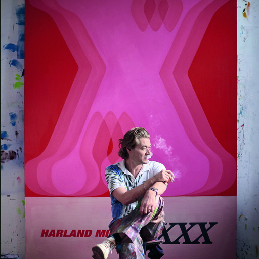
XXX, 2023, is taken from a painting of the same title, first shown in Miller’s 2019 solo show at White Cube, Hong Kong. The print takes the form of the cover of a novel, with the top section a complex graphic layering of letters and colors, counterbalanced by a clean band of neutral color bearing the title and author/artist’s name. Drips of paint at the bottom of the canvas expose its layering of colors.
The work was one of the last the artist completed before his Hong Kong show. Harland told us at the time that the paint was still drying when it was loaded onto the boat bound for Hong Kong.
Miller’s letter paintings are part of an ongoing series in which the artist employs mono or bi-syllabic words to create hard-edged letter paintings with bold, saturated colors. They reference, among other elements, Robert Rauschenberg and Ed Ruscha’s use of vernacular signage. But they could also be a reaction to the fact that, as the artist admits, he’s no fan of using ten words when twenty will do.
“I confess to having always liked the form of the haiku,” Miller says. “Primarily because of the value it puts on the syllable. If, as the poet John Cooper Clarke says, ‘To convey one’s mood / in seventeen syllables / is very di-fic…’ – how much harder would it be then using just one syllable or two? Up, If, No.”
In the works, Miller depicts his letters in a range of typefaces, through a process of isolating, overlaying and reconnecting, to create a sense of depth in the image that deconstructs and abstracts the meaning of language itself.
The letter X is significant to the artist in its form and design but also given its connotations and connection to punk rock and X-rated cinema. The letters are built up from layers of various colors, their image suggesting objects in motion, where several forms are compressed at once, kaleidoscopic and transparent – like a series of sequential, transparent slides.
Miller has a long association with the ICA. He was part of the Fools Rain group exhibition there in 1996 and was the Writer-in-Residence in 2002.
Buy XXX, 2023 here, and get a copy of Miller’s updated and revised Phaidon book, In Shadows I Boogie, here.