Loie Hollowell’s paintings radiate light as though energized from within by a vital life force. The artist, who was born in Woodland, California, in 1983, and lives and works in Queens, New York, is represented by Pace; has had her work featured in Artforum, Vogue, and the New York Times, among other publications; and is one of over a hundred rising artists chosen by a panel of curators, critics and museum directors included in Phaidon’s new book Prime: Art’s Next Generation. And this week she issues her debut Artspace edition Yellow Brain, 2022.
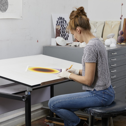
A defining characteristic of Hollowell’s handling of surface is best understood by viewing her work in profile. Each painting begins as a canvas stretched over panel. Onto this, undulating bulges and crisp silhouettes of high-density foam are mounted and then sealed with acrylic medium before painting in oil. As such, the paintings often appear ripe like gourds, with pronounced sculptural elements and intersecting segments providing a shapely topography upon which highly worked color gradients are meticulously laid. This three-dimensionality is often paired with a dense lattice of two-dimensional marks creating illusionistic contours, so the paintings seem to advance and recede in front of the viewer.
Her Artspace edition Yellow Brain, 2022, reflects this practice, featuring an embossed violet gradient that anchors the print image, echoing the elevation of the three-dimensional rectilinear form that protrudes from the original painting.
Proceeds from the sale of Yellow Brain, 2022 will be donated to the Malaria Consortium, one of the world’s leading non-profit organisations specialising in the prevention, control and treatment of malaria and other communicable diseases among vulnerable populations.
Yellow Brain, 2022 Embossed Silkscreen on Somerset 300gsm Edition of 50 + 5 APs, and 1 Printer’s Proof 16 x 11.7 inches (40.64 x 29.72 cm) $6,500 USD
The abiding subject of Hollowell’s work is the experience of her own body. Sex, conception, pregnancy, birth, and postpartum provide the conceptual underpinnings for her visual language. Her paintings glow with a spiritual geometry, a quality inspired by Indian Neo-Tantric artists of the 1960s and ’70s, such as the painters Ghulam Rasool Santosh and Biren De.
But at the same time, the sheer luminosity of Hollowell’s work is indebted to her California roots and that state’s eminent proponents of the Light and Space movement. And as she tells us in this interview – the inspiration for her new edition is rooted in that movement along with a very poignant and personal experience much closer to home.
As a young girl, Hollowell bounced between the two studios of her artist parents, learning to sew from her fabric artist mother and taking in the fundamentals of paint composition from her Yale-educated father.
“My mom taught me to sew when I was really young,” she tells Artspace. “In third grade I had a scrunchy business! I would make hair ties at home and then sell them for three dollars each. I was also painting, but I didn’t start considering myself a painter until I moved to undergrad. In my early twenties I decided I would focus on painting and not fabric art anymore.
I got into school for fashion design and also into school for fine art. It’s kind of embarrassing but when I was in my early teens, I modelled in San Francisco. And I found that the fashion industry was not as accommodating, and not as friendly or open-minded, in my view at that young age, as the hippy dippy artists that my mum and dad hung out with.
I felt the art crowd was more my kind of people – the weirdoes and the misfits – not the hip fashion school kids. It was more just like the type of people I felt I wanted to be around. I’m sure there’s a place for everyone in the fashion industry but for me, it was a little intimidating.
When did you find your artistic voice and realise things were moving into position for you? Really in undergrad when I was making fabric dresses as well as painting. I think through the combination of the two I found a way to speak about my personal experience of the world. But it seemed like painting became a more direct way to share my ideas than fashion.
I was starting to have intimate relationships with people and realising that there’s a lot of content in sexuality. It was just fun to comment on female sexuality, and my sexuality. And in the context of where I went to school – UC Santa Barbera- it was a surfer culture; lots of scantily clad surfer babes walking around, sexy men, and it kind of worked its way into my paintings.
Your work is anatomical but also super abstract, how did the life drawing teachers react to it? Because my dad was a painter, he had given me all of these intense formal lessons on how to construct a composition using color and light and space. So, I felt that when I started painting, I already had a strong grounding in how to construct an image. I did do life drawing classes and painting classes, but the kind of geometric abstraction that I’m working with now really only came into play after graduate school, around 2010/2012.
What age was that? I took five years off, so I guess was 28. I got done with grad school and I got pregnant and decided to have an abortion because I could not see a future with this person. And that experience – it was really emotional. Basically, it was fine, like a very streamlined procedure – Planned Parenthood is amazing – but the experience led me to want to talk about it in a more open-ended way. Instead of painting a vagina directly, I thought I could share something more open-ended by extracting my vagina, and extracting the penis and extracting the semen, and all the stuff that was involved, and that’s how I came upon this kind of geometric abstraction.
At the time I was looking at Charles Burchfield and Helen Torr and Georgia O’Keeffe and all these kinds of New York regional painters and finding my own voice through that. I was looking at a lot of Kay Sage, another American painter who was doing her own thing; Agnes Pelton, Florence Miller Pierce – groups of people that were tangential to the idea of modern abstraction that was going on.
So I think at that point the making of paintings about my abortion really opened up my ability to speak about really personal things in this abstract language in which I could place tiny hints of things. OK that is hair; that could be a vagina; that’s in the shape of a phallic symbol; so that could be a penis.
But I was trying to disguise them through abstraction and color, and letting color also be a character in the paintings that was aiding the sexual narrative but also distracting someone who might be averse to having to deal with that narrative.
Which suggests an element of self-censoring? Yeah, self-censoring because the paintings I was doing at the end of grad school were all figurative portraits of me looking at my vagina or strangling my ex-boyfriend. They were all very aggressive and didactic. And I think that I had a lot of criticism of my work in grad school.
Figurative work was very, very unhip when I was there and so I came out of grad school very self-conscious of these figurative paintings and that was another reason I was self-censoring and moving into abstraction to really say the same thing I was saying with the figurative paintings.
Would it be true to say the directional shifts in your practice seem, for the most part, to have been sparked by changes in your body – sometimes ones that you yourself have initiated? Yeah, actually they really have all been centered on my womb and my vagina. The first being when I had the abortion, and the second being my first and second pregnancies which were really close together; and with the second pregnancy it coincided with the pandemic and the lockdown in New York City.
After I got pregnant, my husband took casts of my third trimester belly and breasts, and over the year-and-a-half years between that pregnancy and the second, I contemplated this cast and thought about how I could incorporate these body parts into my work and with his help figured out how to cast different parts of the original mold and attach them to the painting.
In a sense, I’m going back to figuration in my more recent work where I’m taking actual elements of my pregnant belly and engorged breasts and gluing them onto the surface of the painting, and using my lexicon of geometric abstraction, and layering that on top of the really sculptural things.
So that three dimensionality to the work has always been there? It came in very quickly. I made about five or six of these abortion paintings and right after that I started building up the surface and it was a means to highlight this element of the paintings that I was repeating a lot, the mandorla – it means almond in Italian. It was a shape that I also found in a lot of Gothic and medieval imagery surrounding the Virgin Mary. This glowing mandorla shape of light, kind of coming from around her. I used that as a metaphor for my vagina and I really wanted to highlight that area. So, I started sculpting mandorlas and painting with sawdust and gel in a really crude way to sculpt them. Over time I’ve decided to pop out a lot of different areas of the bodily elements in the paintings.
The way you do this reminds us of the way in which Isamu Noguchi used the form in his sculptures. Well, I like that you bring Noguchi! He is 100 per cent my favorite sculptor. The kind of caress that he gives to his surfaces, the intricacy with the interconnected parts supporting each other, the attention to detail and the scale – being in scale with his body for the most part. I really relate to that, yeah. They’re very bodily for sure.
There’s a suggestion of a benign presence in them which has led some people to see some kind of spiritual element to the work. Do you think there is? I think that honing down elements of my body into these shapes or symbols just in its essence gets taken to a place of spiritual visual language. We see it in Klimt, and we see it in Agnes Pelton. I don’t think the work is spiritual in that everyone thinks of the spirit, but, in a way, they are very sacred to me, they are personal shapes – like how we might think of getting a tattoo.
So maybe a better description would be universality? I was thinking in the beginning around the idea of how can you make something completely universal but it’s impossible. I now push against the idea of my work being universal, and I think about it as being very specific to me. But of course it becomes universal in a way because many women have that same intrinsic relationship to their body parts. The color choices and shapes and chiaroscuro – they are all very much personifications of my ‘self’ and that is so specific. But I really appreciate that so many different types of people come to the work and get something else out of it. And in that way, while I still don’t think it’s perhaps universal, it does become open-ended.
And also when you stand in front of them they seem to breathe! Oh really? That’s cool.That’s great. Yeah, I think that actually putting these shapes onto the surface of the panel really embodies them with my ‘being’ in a way, and as I make the paintings, I’m not just working over a flat image, I’m actually dealing with depth and space and reality and thinking about real light versus illusionary light. I really put a lot of myself into it in that way, both physically and emotionally. I’m basically turning these paintings into bodies. They’re like rectangular human manifestations of a specific time and place, or a specific emotional space. I guess, in that way, that could also be seen as some kind of spiritual journey; like communing with the painting.
When it comes to an edition like the new Artspace one, how do you convey that in a two dimensional manner? That’s an interesting question because the paintings that the edition is based on actually came from a totally different place. I made them for my dad who had a traumatic brain injury a year ago. He fell from a ladder straight down on his head onto concrete. He is physically back to himself, but he lost his ability to talk. So he has severe aphasia. He was in the hospital for a long time on life support and when he became conscious he wasn’t able to speak at all – not even make sounds. Now he can make sounds, he just can’t quite communicate with words yet.
So the series of works that this print is based on came out of the desire to want to make color field experiences for him, something for him to meditate on. He is a painter – a very formally rich and super intensely Yale-educated formalist painter – and so I thought making these really basic color studies would be something like a tribute to him. I was thinking about how these would actually function if I was in his position, and trying to regain consciousness, and absorb color through this new brain space that got totally discombobulated from the fall. I tried all these different colors when he was coming out of the induced coma.
They all go from light to dark, so I was also thinking of them as black holes or some sort of funnel – the light is going into this dark space. The bar at the bottom is a grounding element. Something like a nebulous orb hovers on top of it or is grounded by it. And the color of the bar at the bottom acts as a complimentary color to the concave oval itself.
I just basically started with the basic primary colors, and then went to the secondaries and the tertiaries. And then I got side-tracked and thought about how I could do another version of blue or another version of purple. And I kind of just let my mind just flow with whatever color I needed to see next. So there was no real rhyme or reason to the colors, except that making one led to the next one. They worked in order. In my mind there’s groupings but there wasn’t too much of a strong reason.
And how did you come to choose the yellow that you did for this edition? I think yellow is often the color I find the most forgiving, and also the most specific in its representation of light. It’s just a very direct representation of light. It’s often the color I’ll paint the mandorla shapes in. It’s forgiving but it’s also challenging to start with a bright yellow and turn it into a deep color, because it can just get browned out and muddied. So I was really trying to play with how yellow would descend to orange and then descend to a burnt sienna and then let it go all the way to black; and honestly, I think it was the first or second drawing I did and I think it was one of the ones that turned out the best.
That decision to make it more minimal in that way was something I thought was going to be a much easier space to paint. But it actually was way harder to make these huge sloths of color, these huge areas of light going to dark. And it gave me a new respect for minimalist painters.
We always ask our artists where they think their edition should be hung? Oh, good question. I think probably in a smaller room, in a little reading nook or cranny. Somewhere you can give it your attention. Maybe a side area so that you can really get up close and look at all the screen-printing texture. There’s a subtle embossment at the bottom that you wouldn’t catch unless you got up close. In the painting, the bar at the bottom that’s embossed on the print is built up. It’s a bar that comes out an inch-and-a-half from the surface. So it’s like a physical horizon line. While the rest of the painting is kind of like this physically flat space, I mean for the bar itself to be a platform or a horizon for this deep space thing to sit on.
And finally, how did you come to choose the Malaria Corsortium as a beneficiary of the edition? I chose The Malaria Consortium following the advice of GiveWell, a research group that looks at which charities have the highest impact for the most amount of people around the world each year. The Malaria Consortium was their top-rated charity this year for cause prioritization and greatest impact. The hope being that statistically the most lives are saved per dollar so to speak.
To see more of the edition, go to Loie Hollowell’s artist page on Artspace here.