


One of the most important—and often overlooked—elements in preparing your work for galleries is presentation. A strong, cohesive presentation reinforces your professionalism and makes your work more appealing to both galleries and collectors. But it doesn’t have to break the bank.
Some artists assume gallery-ready means expensive custom framing or elaborate finishes, but that’s not the case. In fact, many of the artists in my gallery don’t frame their work at all. Instead, they use gallery-wrapped canvases with painted or finished edges, or cradled panels with clean sides. It’s a minimalist, professional look—and when done consistently, it works beautifully.
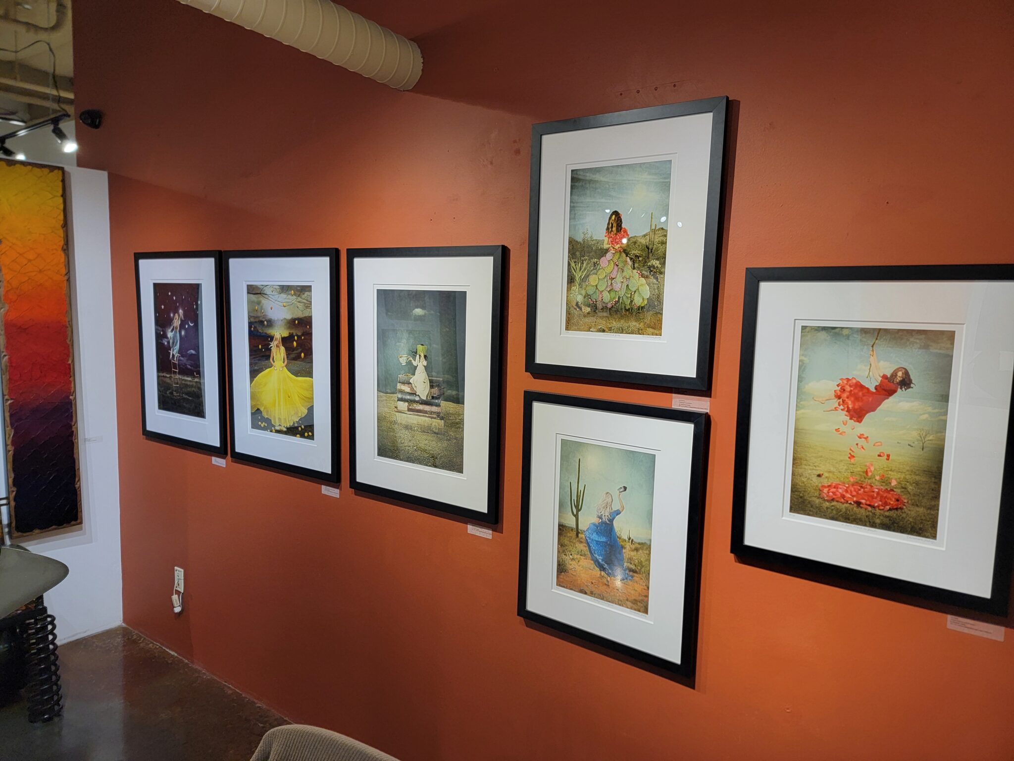
Why Galleries Group Work by Artist
Most galleries display an artist’s work together, often in clusters or on a dedicated wall. There’s a practical reason for this: grouping creates visual coherence and helps the viewer connect with the work.
When a collector walks into a gallery and sees several pieces by the same artist presented together, they begin to see the bigger picture—your voice, your themes, your range. It also makes it easier to compare works and increases the likelihood of multiple-piece sales.
But for that effect to work, the presentation has to be unified. If one piece is framed in dark wood, another in white metal, and the third is a bare-edged panel, the visual connection starts to break down.
Consistency Signals Professionalism

Whether you frame or not, consistency is key. When your presentation is unified—whether that means using the same profile and color frame, or sticking with gallery-wrapped canvases with finished edges—it tells a viewer: this is a professional body of work.
This principle holds true for sculptors and mixed-media artists as well. Your pedestals, bases, mounts, or hardware should feel cohesive from piece to piece. If your work includes installation components or display structures, those should reflect a clear design choice that supports the artwork without distracting from it.
Consistency doesn’t mean identical—it means intentional. Even with variation in size, medium, or subject matter, a coherent presentation creates trust and elevates the overall impression of your work.
Simple = Smart
You don’t need high-end framing or elaborate mounting solutions. In fact, simpler is often better:
-
My father (John Horejs) uses a simple gallery-wrap to create consistency in the presentaiton of his work. For paintings or 2D work: narrow black or white wood frames, floater frames, or well-finished gallery wraps all work well.
-
For works on paper: stick with white or off-white mats and simple frames that don’t compete with the art.
-
For sculpture: use uniform bases or pedestals in a consistent color or material that complement the work.
-
For mixed-media: define a presentation approach—whether floating mount, shadow box, or edge treatment—and stick with it.

Keeping things simple and consistent also saves you money. You can order in bulk, avoid surprises at the frame shop, and estimate your materials and shipping costs more accurately.
For more detailed framing strategies, I recommend reading this post on RedDotBlog:
https://reddotblog.com/mastering-the-art-of-framing/
Simplify to Save Time and Build Your Brand
Consistency isn’t just about appearance—it also simplifies your business operations.
-
One standard format means fewer supplier relationships to manage
-
You can create templated display, shipping, and pricing processes
-
You avoid last-minute scrambles or mismatched presentation at shows
-
Your collectors learn to recognize your work—and trust what they’re getting
And here’s the best part: when your presentation is clear and consistent, the focus stays on the artwork.
Final Thought: Build Consistency from the Start
If you’re just getting started, now is the perfect time to set presentation standards. And if you’re further along, it’s worth taking a moment to evaluate whether your current approach supports your goals—or complicates them.
Choose a presentation strategy—whether that’s a clean gallery wrap, a specific frame style, or a sculpture base—and commit. This small decision can create a big shift in how your work is perceived and how smoothly your art business runs.
Remember: consistency doesn’t limit creativity—it supports it. A thoughtful presentation allows your work to speak with clarity, confidence, and professionalism.